> ## Documentation Index
> Fetch the complete documentation index at: https://docs.getsabo.com/llms.txt
> Use this file to discover all available pages before exploring further.
# Progress
> Linear progress indicator.
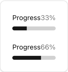 * **Location**: `sabo/src/components/ui/progress.tsx`
## When to use
* Indicate completion percentage of a determinate process (0–100).
* For indeterminate loading, use a Spinner or Skeleton.
## Usage
```tsx sabo/src/components/ui/progress.tsx theme={null}
import { Progress } from "@/components/ui/progress";
export function Example() {
return ;
}
```
## Key props
Progress percent (0–100). The bar translates based on this value.
Width/height or color overrides (e.g.,
* **Location**: `sabo/src/components/ui/progress.tsx`
## When to use
* Indicate completion percentage of a determinate process (0–100).
* For indeterminate loading, use a Spinner or Skeleton.
## Usage
```tsx sabo/src/components/ui/progress.tsx theme={null}
import { Progress } from "@/components/ui/progress";
export function Example() {
return ;
}
```
## Key props
Progress percent (0–100). The bar translates based on this value.
Width/height or color overrides (e.g., w-64, h-3).
## Styling tip
* Increase thickness via h-3 or h-4.
* Use contextual color by wrapping in themed containers or adjusting bg-primary.
## Accessibility
* Provide nearby text for context (“Uploading 42%”).
* If used as a status, associate with an element describing the task.