> ## Documentation Index
> Fetch the complete documentation index at: https://docs.getsabo.com/llms.txt
> Use this file to discover all available pages before exploring further.
# Separator
> Visual divider for content sections.
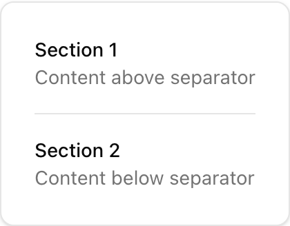 * **Location**: `sabo/src/components/ui/separator.tsx`
## When to use
* Visually divide content within cards, dropdowns, and pages.
* Choose orientation based on layout direction.
## Usage
```tsx sabo/src/components/ui/separator.tsx theme={null}
import { Separator } from "@/components/ui/separator";
export function Example() {
return (
* **Location**: `sabo/src/components/ui/separator.tsx`
## When to use
* Visually divide content within cards, dropdowns, and pages.
* Choose orientation based on layout direction.
## Usage
```tsx sabo/src/components/ui/separator.tsx theme={null}
import { Separator } from "@/components/ui/separator";
export function Example() {
return (
Section A
Section B
);
}
```
## Key props
horizontal (default) | vertical
If true (default), hidden from assistive tech. Set false if used as a semantic separator.
This component forwards all props from Radix Separator primitives. Above are commonly used props. For the full API, see Radix docs: [https://www.radix-ui.com/primitives/docs/components/separator](https://www.radix-ui.com/primitives/docs/components/separator)
## Styling tip
* Add my-3 / mx-3 spacing around separators.
* Change color via bg-border overrides for stronger/lighter rules.
## Accessibility
* Keep decorative=true for visual lines only.
* If conveying structure, set decorative=false so screen readers announce it.