> ## Documentation Index
> Fetch the complete documentation index at: https://docs.getsabo.com/llms.txt
> Use this file to discover all available pages before exploring further.
# Accordion
> Expand/collapse content sections.
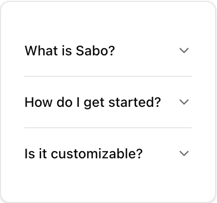 * **Location**: `sabo/src/components/ui/accordion.tsx`
## When to use
* Group multiple sections where only headings are visible by default.
* Use one-at-a-time (single) or multi-open (multiple) behavior.
## Usage
```tsx sabo/src/components/ui/accordion.tsx theme={null}
import {
Accordion, AccordionItem, AccordionTrigger, AccordionContent
} from "@/components/ui/accordion";
export function Example() {
return (
Section 1
Content 1
Section 2
Content 2
);
}
```
## Key props
Controls whether only one item can be open at a time (
* **Location**: `sabo/src/components/ui/accordion.tsx`
## When to use
* Group multiple sections where only headings are visible by default.
* Use one-at-a-time (single) or multi-open (multiple) behavior.
## Usage
```tsx sabo/src/components/ui/accordion.tsx theme={null}
import {
Accordion, AccordionItem, AccordionTrigger, AccordionContent
} from "@/components/ui/accordion";
export function Example() {
return (
Section 1
Content 1
Section 2
Content 2
);
}
```
## Key props
Controls whether only one item can be open at a time (single) or multiple (multiple).
Whether the open item in a single accordion can be collapsed.
This component forwards all props from Radix Accordion primitives (Root/Item/Trigger/Content). Above are commonly used props. For the full API, see Radix docs: [https://www.radix-ui.com/primitives/docs/components/accordion](https://www.radix-ui.com/primitives/docs/components/accordion)
## Styling tip
* Trigger rotates the chevron on open; avoid replacing it with heavy icons.
* Keep content padding light; Accordion should feel compact.
## Accessibility
* Uses disclosure semantics; headings are keyboard navigable.