> ## Documentation Index
> Fetch the complete documentation index at: https://docs.getsabo.com/llms.txt
> Use this file to discover all available pages before exploring further.
# Chart
> Theme-aware chart container and tooltip utilities built on Recharts.
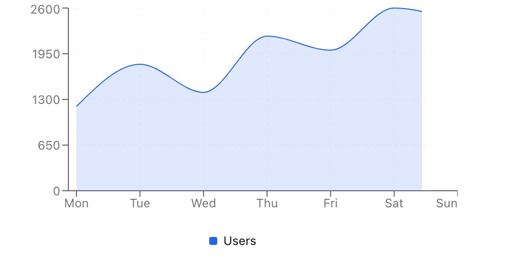 * **Location**: `sabo/src/components/ui/chart.tsx`
## When to use
* Render charts with consistent theming and shared tooltip patterns.
* Use for data visualization that needs to respect light/dark mode.
## Usage
```tsx theme={null}
import { ChartContainer, type ChartConfig } from "@/components/ui/chart";
import { LineChart, Line, XAxis, YAxis } from "recharts";
const config: ChartConfig = {
users: { label: "Users", color: "hsl(221.2 83.2% 53.3%)" },
};
export function Example() {
return (
);
}
```
## Key props
Series config. Injects CSS variables like `--color-{key}` for use by chart primitives.
## Key parts
Reusable tooltip wrapper and customizable tooltip content renderer.
Legend wrapper and customizable legend content renderer.
## Styling tip
Define series colors in `config` for automatic light/dark mode support.
```tsx theme={null}
const config: ChartConfig = {
users: { label: "Users", color: "hsl(221.2 83.2% 53.3%)" },
};
// Use var(--color-users) in chart components
```
## Accessibility
* Provide descriptive labels in `ChartConfig` for screen reader context.
* Use sufficient color contrast and consider patterns/markers for color-blind users.
* Include a summary or data table alternative for complex charts.
* **Location**: `sabo/src/components/ui/chart.tsx`
## When to use
* Render charts with consistent theming and shared tooltip patterns.
* Use for data visualization that needs to respect light/dark mode.
## Usage
```tsx theme={null}
import { ChartContainer, type ChartConfig } from "@/components/ui/chart";
import { LineChart, Line, XAxis, YAxis } from "recharts";
const config: ChartConfig = {
users: { label: "Users", color: "hsl(221.2 83.2% 53.3%)" },
};
export function Example() {
return (
);
}
```
## Key props
Series config. Injects CSS variables like `--color-{key}` for use by chart primitives.
## Key parts
Reusable tooltip wrapper and customizable tooltip content renderer.
Legend wrapper and customizable legend content renderer.
## Styling tip
Define series colors in `config` for automatic light/dark mode support.
```tsx theme={null}
const config: ChartConfig = {
users: { label: "Users", color: "hsl(221.2 83.2% 53.3%)" },
};
// Use var(--color-users) in chart components
```
## Accessibility
* Provide descriptive labels in `ChartConfig` for screen reader context.
* Use sufficient color contrast and consider patterns/markers for color-blind users.
* Include a summary or data table alternative for complex charts.