> ## Documentation Index
> Fetch the complete documentation index at: https://docs.getsabo.com/llms.txt
> Use this file to discover all available pages before exploring further.
# Collapsible
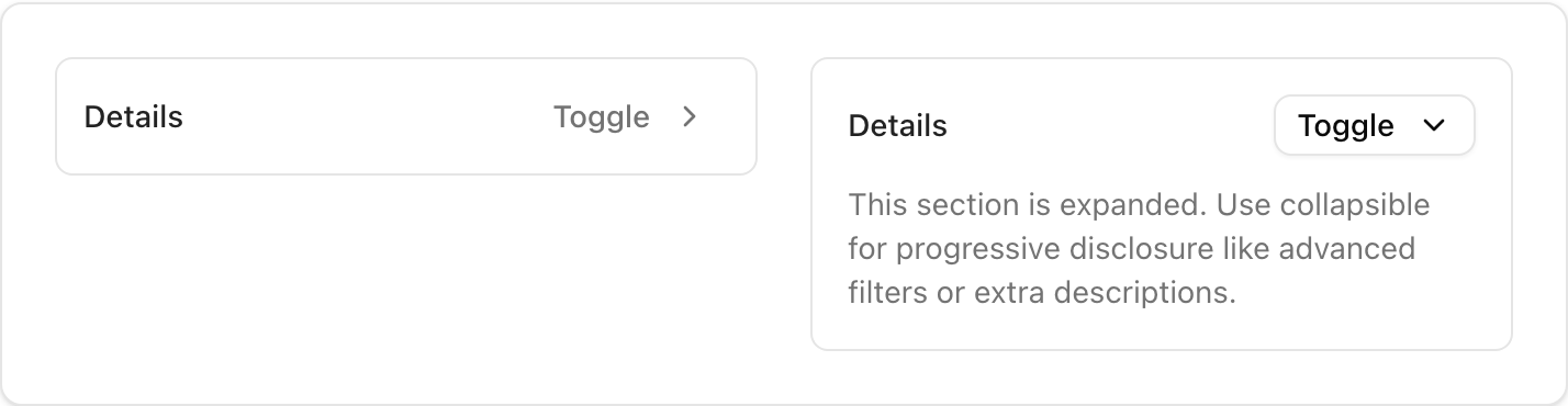
> Toggle visibility for small content blocks.
* **Location**: `sabo/src/components/ui/collapsible.tsx`
## When to use
* Show/hide a small chunk of content (filters, advanced options).
* Lighter than Accordion; you control trigger/button UI.
## Usage
```tsx sabo/src/components/ui/collapsible.tsx theme={null}
import {
Collapsible, CollapsibleTrigger, CollapsibleContent
} from "@/components/ui/collapsible";
import { Button } from "@/components/ui/button";
export function Example() {
return (
Details
Hidden content goes here.
);
}
```
## Key props
Initial open/closed state.
Render trigger/content as child elements.
This component forwards all props from Radix Collapsible primitives (Root/Trigger/Content). Above are commonly used props. For the full API, see Radix docs: [https://www.radix-ui.com/primitives/docs/components/collapsible](https://www.radix-ui.com/primitives/docs/components/collapsible)
## Styling tip
* Provide clear visual feedback on open/close (icons, text).
* Keep content short; for larger sections use Accordion.
## Accessibility
* Ensure the trigger is focusable; announce state via aria-expanded if you customize markup.
 * **Location**: `sabo/src/components/ui/collapsible.tsx`
## When to use
* Show/hide a small chunk of content (filters, advanced options).
* Lighter than Accordion; you control trigger/button UI.
## Usage
```tsx sabo/src/components/ui/collapsible.tsx theme={null}
import {
Collapsible, CollapsibleTrigger, CollapsibleContent
} from "@/components/ui/collapsible";
import { Button } from "@/components/ui/button";
export function Example() {
return (
* **Location**: `sabo/src/components/ui/collapsible.tsx`
## When to use
* Show/hide a small chunk of content (filters, advanced options).
* Lighter than Accordion; you control trigger/button UI.
## Usage
```tsx sabo/src/components/ui/collapsible.tsx theme={null}
import {
Collapsible, CollapsibleTrigger, CollapsibleContent
} from "@/components/ui/collapsible";
import { Button } from "@/components/ui/button";
export function Example() {
return (