> ## Documentation Index
> Fetch the complete documentation index at: https://docs.getsabo.com/llms.txt
> Use this file to discover all available pages before exploring further.

# Scroll Area

> Custom scrollable container with styled scrollbars.

<Frame>
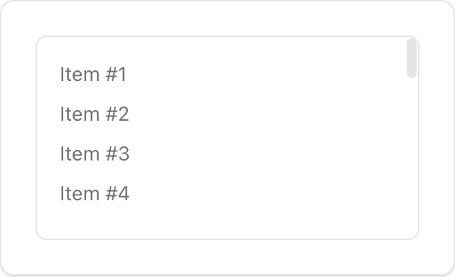
  <img src="https://mintcdn.com/aristotechnologiesinc/AI-6KNJJN4jkkZTo/images/ui/scroll-area-light.png?fit=max&auto=format&n=AI-6KNJJN4jkkZTo&q=85&s=6051679114d580e8bbcdd1243cd7cd56" alt="Scroll Area component preview (light)" width="240" data-path="images/ui/scroll-area-light.png" />
</Frame>

* **Location**: `sabo/src/components/ui/scroll-area.tsx`

## When to use

* Constrain overflow for long lists or code blocks with consistent, themed scrollbars.
* Use for panels and menus that require scrolling.

## Usage

```tsx sabo/src/components/ui/scroll-area.tsx theme={null}
import { ScrollArea } from "@/components/ui/scroll-area";

export function Example() {
  return (
    <ScrollArea className="h-32 w-64 rounded-md border p-3">
      <div className="space-y-2">
        {Array.from({ length: 20 }).map((_, i) => (
          <div key={i} className="text-sm text-muted-foreground">Item #{i + 1}</div>
        ))}
      </div>
    </ScrollArea>
  );
}
```

## Key props

<ParamField path="className" type="string">
  Set fixed <code>height</code>/<code>width</code> for the viewport. Rounded corners are preserved.
</ParamField>

<Note>
  This component forwards all props from Radix Scroll Area primitives (Root/Viewport/Scrollbar, etc.). Above are commonly used props. For the full API, see Radix docs: [https://www.radix-ui.com/primitives/docs/components/scroll-area](https://www.radix-ui.com/primitives/docs/components/scroll-area)
</Note>

## Styling tip

* Customize thumb and rail with <code>\[data-slot=scroll-area-thumb]</code> and scrollbar orientation classes.

## Accessibility

* Keep focus outlines on the viewport (<code>focus-visible</code> styles already applied).
