> ## Documentation Index
> Fetch the complete documentation index at: https://docs.getsabo.com/llms.txt
> Use this file to discover all available pages before exploring further.
# Alert
> Inline feedback for success, warning, and error.
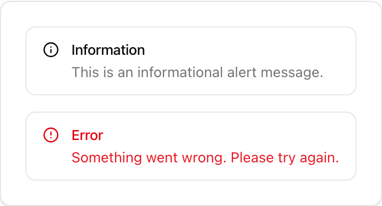 * **Location**: `sabo/src/components/ui/alert.tsx`
## When to use
* Display inline status inside a page (success message, non-blocking warning, error summary).
* Prefer Dialog for blocking confirmations and Toast for transient notifications.
## Usage
```tsx sabo/src/components/ui/alert.tsx theme={null}
import { Alert, AlertTitle, AlertDescription } from "@/components/ui/alert";
import { CircleAlertIcon, CheckCircleIcon } from "lucide-react";
export function Example() {
return (
* **Location**: `sabo/src/components/ui/alert.tsx`
## When to use
* Display inline status inside a page (success message, non-blocking warning, error summary).
* Prefer Dialog for blocking confirmations and Toast for transient notifications.
## Usage
```tsx sabo/src/components/ui/alert.tsx theme={null}
import { Alert, AlertTitle, AlertDescription } from "@/components/ui/alert";
import { CircleAlertIcon, CheckCircleIcon } from "lucide-react";
export function Example() {
return (
Saved
Your changes were saved successfully.
Failed to save
Check your connection and try again.
);
}
```
## Key props
default | destructive — toggles error styling.
## Styling tip
* Place an icon as the first child to enable the compact two‑column layout.
* Keep titles short; put details in AlertDescription.
## Accessibility
* Uses role="alert". Ensure plain text content is readable by screen readers.