> ## Documentation Index
> Fetch the complete documentation index at: https://docs.getsabo.com/llms.txt
> Use this file to discover all available pages before exploring further.
# Calendar
> Date picker component.
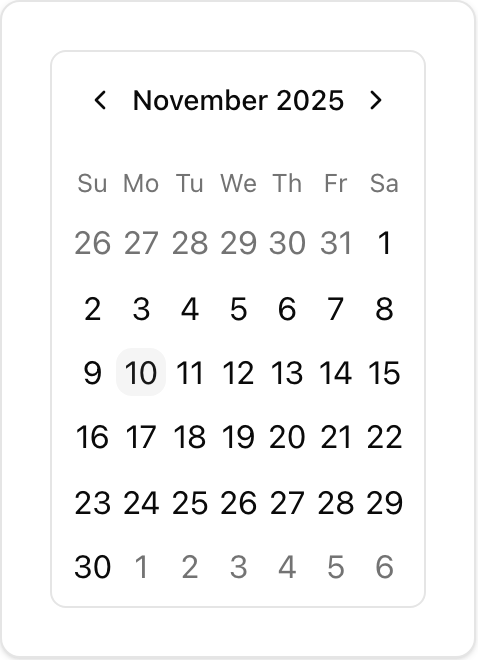 * **Location**: `sabo/src/components/ui/calendar.tsx`
## When to use
* Select a single date or a range; shows month navigation and keyboard focus.
* Good for filters, booking flows, analytics time windows.
## Usage
```tsx sabo/src/components/ui/calendar.tsx theme={null}
import { Calendar } from "@/components/ui/calendar";
export function Example() {
return ;
}
```
## Key props
Render days from adjacent months.
* **Location**: `sabo/src/components/ui/calendar.tsx`
## When to use
* Select a single date or a range; shows month navigation and keyboard focus.
* Good for filters, booking flows, analytics time windows.
## Usage
```tsx sabo/src/components/ui/calendar.tsx theme={null}
import { Calendar } from "@/components/ui/calendar";
export function Example() {
return ;
}
```
## Key props
Render days from adjacent months.
label | dropdown. Dropdown adds month/year selects.
Customize internal slots from react-day-picker (e.g., month\_caption, day).
Applies Button variants to the nav buttons.
## Styling tip
* Control cell size with \[--cell-size:--spacing(8)].
* Use buttonVariant to align navigation buttons with your design.
## Accessibility
* Keyboard navigation is supported; focus outlines are prominent.
* Provide labels for the filter context (“From/To date”).