> ## Documentation Index
> Fetch the complete documentation index at: https://docs.getsabo.com/llms.txt
> Use this file to discover all available pages before exploring further.
# Field
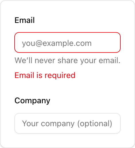
> Form field wrapper for labels, hints, and errors.
* **Location**: `sabo/src/components/ui/field.tsx`
### What it is
* **Layout wrapper** for a form control. It does not render an input by itself.
* Provides slots: `FieldLabel`, `FieldContent`, `FieldDescription`, `FieldError`.
* Supports `orientation`: `vertical` (default), `horizontal`, `responsive`.
### When to use
* You want a consistent pattern with label + control + help/error text.
* You need horizontal alignment (label left, control right).
### How it differs from others
* **Field vs Input**: Field is the container; Input is the control inside.
* **Field vs Label**: Field includes a label slot but is not a label itself.
* **Field vs Input Group**: Input Group composes prefixes/suffixes around a control; Field composes the meta text around a control.
### Minimal usage
```tsx sabo/src/components/ui/field.tsx theme={null}
import {
Field,
FieldLabel,
FieldContent,
FieldDescription,
FieldError,
} from "@/components/ui/field";
import { Input } from "@/components/ui/input";
export function Example() {
return (
EmailWe’ll never share your email.Email is required
);
}
```
 * **Location**: `sabo/src/components/ui/field.tsx`
### What it is
* **Layout wrapper** for a form control. It does not render an input by itself.
* Provides slots: `FieldLabel`, `FieldContent`, `FieldDescription`, `FieldError`.
* Supports `orientation`: `vertical` (default), `horizontal`, `responsive`.
### When to use
* You want a consistent pattern with label + control + help/error text.
* You need horizontal alignment (label left, control right).
### How it differs from others
* **Field vs Input**: Field is the container; Input is the control inside.
* **Field vs Label**: Field includes a label slot but is not a label itself.
* **Field vs Input Group**: Input Group composes prefixes/suffixes around a control; Field composes the meta text around a control.
### Minimal usage
```tsx sabo/src/components/ui/field.tsx theme={null}
import {
Field,
FieldLabel,
FieldContent,
FieldDescription,
FieldError,
} from "@/components/ui/field";
import { Input } from "@/components/ui/input";
export function Example() {
return (
* **Location**: `sabo/src/components/ui/field.tsx`
### What it is
* **Layout wrapper** for a form control. It does not render an input by itself.
* Provides slots: `FieldLabel`, `FieldContent`, `FieldDescription`, `FieldError`.
* Supports `orientation`: `vertical` (default), `horizontal`, `responsive`.
### When to use
* You want a consistent pattern with label + control + help/error text.
* You need horizontal alignment (label left, control right).
### How it differs from others
* **Field vs Input**: Field is the container; Input is the control inside.
* **Field vs Label**: Field includes a label slot but is not a label itself.
* **Field vs Input Group**: Input Group composes prefixes/suffixes around a control; Field composes the meta text around a control.
### Minimal usage
```tsx sabo/src/components/ui/field.tsx theme={null}
import {
Field,
FieldLabel,
FieldContent,
FieldDescription,
FieldError,
} from "@/components/ui/field";
import { Input } from "@/components/ui/input";
export function Example() {
return (