> ## Documentation Index
> Fetch the complete documentation index at: https://docs.getsabo.com/llms.txt
> Use this file to discover all available pages before exploring further.
# Input
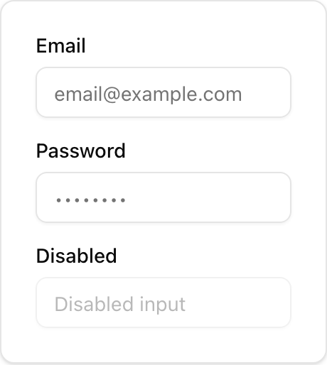
> Text input field.
* **Location**: `sabo/src/components/ui/input.tsx`
### What it is
* **Single form control** that renders a styled ``.
* Handles focus ring, disabled state, and invalid state (`aria-invalid`).
### When to use
* You need a text field.
* Pair with **`Label`** for accessibility, or with **`Field`** when you also want description and error text.
### How it differs from others
* **Input vs Field**: Input is the control; Field is the wrapper for label/help/error layout.
* **Input vs Label**: Label just describes/associates a control; it’s not interactive.
* **Input vs Input Group**: Input Group combines an input with addons (prefix/suffix text, icons, buttons).
### Minimal usage
```tsx sabo/src/components/ui/input.tsx theme={null}
import { Input } from "@/components/ui/input";
export function Example() {
return (
);
}
```
 * **Location**: `sabo/src/components/ui/input.tsx`
### What it is
* **Single form control** that renders a styled ``.
* Handles focus ring, disabled state, and invalid state (`aria-invalid`).
### When to use
* You need a text field.
* Pair with **`Label`** for accessibility, or with **`Field`** when you also want description and error text.
### How it differs from others
* **Input vs Field**: Input is the control; Field is the wrapper for label/help/error layout.
* **Input vs Label**: Label just describes/associates a control; it’s not interactive.
* **Input vs Input Group**: Input Group combines an input with addons (prefix/suffix text, icons, buttons).
### Minimal usage
```tsx sabo/src/components/ui/input.tsx theme={null}
import { Input } from "@/components/ui/input";
export function Example() {
return (
);
}
```
* **Location**: `sabo/src/components/ui/input.tsx`
### What it is
* **Single form control** that renders a styled ``.
* Handles focus ring, disabled state, and invalid state (`aria-invalid`).
### When to use
* You need a text field.
* Pair with **`Label`** for accessibility, or with **`Field`** when you also want description and error text.
### How it differs from others
* **Input vs Field**: Input is the control; Field is the wrapper for label/help/error layout.
* **Input vs Label**: Label just describes/associates a control; it’s not interactive.
* **Input vs Input Group**: Input Group combines an input with addons (prefix/suffix text, icons, buttons).
### Minimal usage
```tsx sabo/src/components/ui/input.tsx theme={null}
import { Input } from "@/components/ui/input";
export function Example() {
return (
);
}
```