 * **Location**: `sabo/src/components/ui/label.tsx`
### What it is
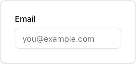
* Accessible **text label** for a form control using Radix Label.
* Associate with a control via `htmlFor` on the label and matching `id` on the input.
### When to use
* Whenever you render a form control (Input, Textarea, Select, etc.).
* Inside a **`Field`** or alone next to a control.
### How it differs from others
* **Label vs Field**: Label is only the text; Field is a layout wrapper that can include label, description, and error.
* **Label vs Input**: Label is non-interactive; Input is the actual control.
### Minimal usage
```tsx sabo/src/components/ui/label.tsx theme={null}
import { Label } from "@/components/ui/label";
import { Input } from "@/components/ui/input";
export function Example() {
return (
* **Location**: `sabo/src/components/ui/label.tsx`
### What it is
* Accessible **text label** for a form control using Radix Label.
* Associate with a control via `htmlFor` on the label and matching `id` on the input.
### When to use
* Whenever you render a form control (Input, Textarea, Select, etc.).
* Inside a **`Field`** or alone next to a control.
### How it differs from others
* **Label vs Field**: Label is only the text; Field is a layout wrapper that can include label, description, and error.
* **Label vs Input**: Label is non-interactive; Input is the actual control.
### Minimal usage
```tsx sabo/src/components/ui/label.tsx theme={null}
import { Label } from "@/components/ui/label";
import { Input } from "@/components/ui/input";
export function Example() {
return (