> ## Documentation Index
> Fetch the complete documentation index at: https://docs.getsabo.com/llms.txt
> Use this file to discover all available pages before exploring further.
# Radio Group
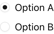
> Single-choice selection with accessible radio inputs.
* **Location**: `sabo/src/components/ui/radio-group.tsx`
## When to use
* Let users select exactly one option from a short list (2-5 items work best).
## Usage
```tsx theme={null}
import { RadioGroup, RadioGroupItem } from "@/components/ui/radio-group";
export function Example() {
return (
);
}
```
## Key props
Initial or controlled value for the group.
Change handler for controlled usage.
Unique value that identifies the item in the group.
This component forwards all props from Radix Radio Group primitives (Root/Item). Above are commonly used props. For the full API, see Radix docs: [https://www.radix-ui.com/primitives/docs/components/radio-group](https://www.radix-ui.com/primitives/docs/components/radio-group)
## Styling tip
Wrap each item with a label for proper hit area.
```tsx theme={null}
```
## Accessibility
* Each radio item must have an associated label for screen readers.
* Use `defaultValue` or `value` to ensure one option is always selected.
* Keyboard navigation (arrow keys) is handled automatically.
 * **Location**: `sabo/src/components/ui/radio-group.tsx`
## When to use
* Let users select exactly one option from a short list (2-5 items work best).
## Usage
```tsx theme={null}
import { RadioGroup, RadioGroupItem } from "@/components/ui/radio-group";
export function Example() {
return (
* **Location**: `sabo/src/components/ui/radio-group.tsx`
## When to use
* Let users select exactly one option from a short list (2-5 items work best).
## Usage
```tsx theme={null}
import { RadioGroup, RadioGroupItem } from "@/components/ui/radio-group";
export function Example() {
return (