> ## Documentation Index
> Fetch the complete documentation index at: https://docs.getsabo.com/llms.txt
> Use this file to discover all available pages before exploring further.
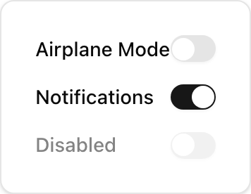
# Switch
> Toggle input for true/false values in forms.
* **Location**: `sabo/src/components/ui/switch.tsx`
## When to use
* Boolean form fields (notifications on/off, enable feature).
* Prefer Switch over Checkbox when the effect is immediate and binary.
## Usage
```tsx sabo/src/components/ui/switch.tsx theme={null}
import { Switch } from "@/components/ui/switch";
export function Example() {
return (
);
}
```
## Key props
Initial on/off state. Use controlled checked for form state libraries.
Customize size or colors via Tailwind (e.g., h-5 w-10).
This component forwards all props from Radix Switch primitives (Root/Thumb). Above are commonly used props. For the full API, see Radix docs: [https://www.radix-ui.com/primitives/docs/components/switch](https://www.radix-ui.com/primitives/docs/components/switch)
## Styling tip
* Use data-\[state=checked]:... selectors to style the on state.
* Wrap with a label for clear affordance and click target.
## Accessibility
* Provide a visible label; keep focus outlines and contrast strong.
 * **Location**: `sabo/src/components/ui/switch.tsx`
## When to use
* Boolean form fields (notifications on/off, enable feature).
* Prefer Switch over Checkbox when the effect is immediate and binary.
## Usage
```tsx sabo/src/components/ui/switch.tsx theme={null}
import { Switch } from "@/components/ui/switch";
export function Example() {
return (
);
}
```
## Key props
* **Location**: `sabo/src/components/ui/switch.tsx`
## When to use
* Boolean form fields (notifications on/off, enable feature).
* Prefer Switch over Checkbox when the effect is immediate and binary.
## Usage
```tsx sabo/src/components/ui/switch.tsx theme={null}
import { Switch } from "@/components/ui/switch";
export function Example() {
return (
);
}
```
## Key props