> ## Documentation Index
> Fetch the complete documentation index at: https://docs.getsabo.com/llms.txt
> Use this file to discover all available pages before exploring further.
# Alert Dialog
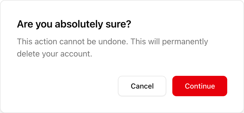
> Destructive action confirmation dialog.
* **Location**: `sabo/src/components/ui/alert-dialog.tsx`
### When to use
* Use for destructive or high-impact actions: delete, reset, revoke.
* Requires explicit choice (Confirm or Cancel). Avoid accidental dismissal.
* Copy should clearly state the consequence.
### How it differs from Dialog
* Stricter UX for confirmation flows.
* Uses “alertdialog” semantics so screen readers announce priority and keep focus until resolved.
### Minimal usage
```tsx sabo/src/components/ui/alert-dialog.tsx theme={null}
Are you absolutely sure?
This action cannot be undone.
CancelConfirm
```
This component forwards all props from Radix Alert Dialog primitives (Root/Trigger/Content, etc.). Above are commonly used props. For the full API, see Radix docs: [https://www.radix-ui.com/primitives/docs/components/alert-dialog](https://www.radix-ui.com/primitives/docs/components/alert-dialog)
 * **Location**: `sabo/src/components/ui/alert-dialog.tsx`
### When to use
* Use for destructive or high-impact actions: delete, reset, revoke.
* Requires explicit choice (Confirm or Cancel). Avoid accidental dismissal.
* Copy should clearly state the consequence.
### How it differs from Dialog
* Stricter UX for confirmation flows.
* Uses “alertdialog” semantics so screen readers announce priority and keep focus until resolved.
### Minimal usage
```tsx sabo/src/components/ui/alert-dialog.tsx theme={null}
* **Location**: `sabo/src/components/ui/alert-dialog.tsx`
### When to use
* Use for destructive or high-impact actions: delete, reset, revoke.
* Requires explicit choice (Confirm or Cancel). Avoid accidental dismissal.
* Copy should clearly state the consequence.
### How it differs from Dialog
* Stricter UX for confirmation flows.
* Uses “alertdialog” semantics so screen readers announce priority and keep focus until resolved.
### Minimal usage
```tsx sabo/src/components/ui/alert-dialog.tsx theme={null}