> ## Documentation Index
> Fetch the complete documentation index at: https://docs.getsabo.com/llms.txt
> Use this file to discover all available pages before exploring further.
# Drawer
> Vaul-based drawer overlay for panels and mobile navigation.
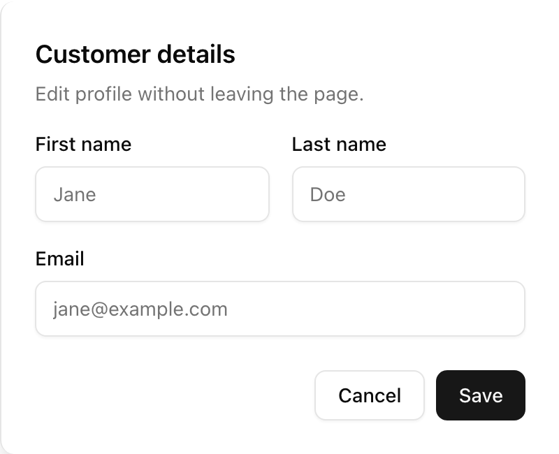 * **Location**: `sabo/src/components/ui/drawer.tsx`
## When to use
* Show contextual panels without leaving the page.
* Use for mobile nav, filters, details, or quick actions.
## Usage
```tsx theme={null}
import { Drawer, DrawerTrigger, DrawerContent, DrawerClose } from "@/components/ui/drawer";
export function Example() {
return (
Open
* **Location**: `sabo/src/components/ui/drawer.tsx`
## When to use
* Show contextual panels without leaving the page.
* Use for mobile nav, filters, details, or quick actions.
## Usage
```tsx theme={null}
import { Drawer, DrawerTrigger, DrawerContent, DrawerClose } from "@/components/ui/drawer";
export function Example() {
return (
Open
Drawer content
Close
);
}
```
## Key props
Main panel container. Direction and animations are handled by Vaul; content styling via Tailwind.
Click target to open the drawer.
Click target to close the drawer.
Backdrop overlay behind the drawer.
Portal root for overlay/content.
Header/footer container sections inside content.
Title and description text wrappers.
This component forwards all props from vaul Drawer primitives (Root/Trigger/Content/Close, etc.). Above are commonly used props. For the full API, see the vaul docs: [https://vaul.emilkowal.ski/](https://vaul.emilkowal.ski/)
## Styling tip
Add padding inside `DrawerContent` and maintain visible focus states.
```tsx theme={null}
...
```
## Accessibility
* Drawer traps focus inside when open; escape key dismisses it.
* Ensure the trigger has a descriptive label; use `aria-label` if needed.