

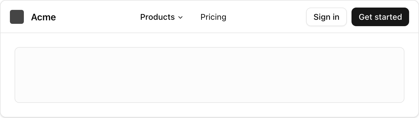
- Location:
sabo/src/components/ui/navigation-menu.tsx
When to use
- Top navigation with dropdown panels (mega menus) for grouped links.
- Use inside your header; supports animated viewport panel and link states.
Usage
sabo/src/components/ui/navigation-menu.tsx
Key props
Render the animated shared viewport panel. Set
false for inline content.This component forwards all props from Radix Navigation Menu primitives (Root/List/Item/Trigger/Content/Link). Above are commonly used props. For the full API, see Radix docs: https://www.radix-ui.com/primitives/docs/components/navigation-menu
Styling tip
- Use
navigationMenuTriggerStyle()for consistent triggers. - Content panels accept any layout; keep widths reasonable (e.g., 320–640px).
Accessibility
- Keyboard friendly: arrow keys, escape, and focus management handled by Radix.