

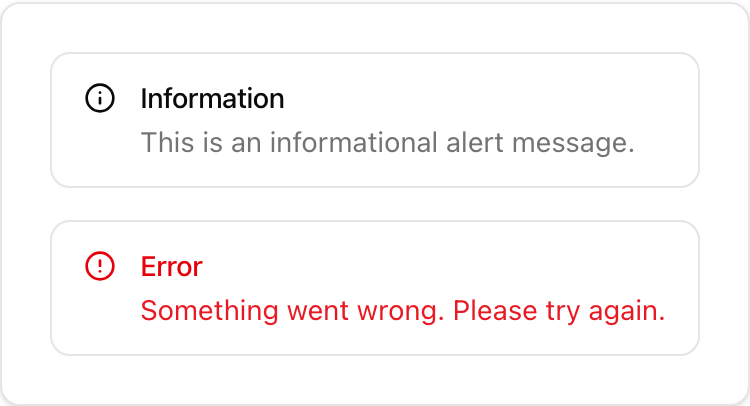
- Location:
sabo/src/components/ui/alert.tsx
When to use
- Display inline status inside a page (success message, non-blocking warning, error summary).
- Prefer Dialog for blocking confirmations and Toast for transient notifications.
Usage
sabo/src/components/ui/alert.tsx
Key props
default | destructive — toggles error styling.Styling tip
- Place an icon as the first child to enable the compact two‑column layout.
- Keep titles short; put details in
AlertDescription.
Accessibility
- Uses
role=“alert”. Ensure plain text content is readable by screen readers.