

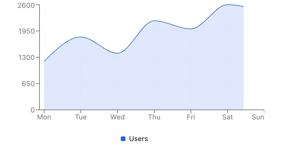
- Location:
sabo/src/components/ui/chart.tsx
When to use
- Render charts with consistent theming and shared tooltip patterns.
- Use for data visualization that needs to respect light/dark mode.
Usage
Key props
ChartContainer.config
Record<string, { label?: ReactNode; color?: string } | { label?: ReactNode; theme: Record<'light'|'dark', string> }>
Series config. Injects CSS variables like
--color-{key} for use by chart primitives.Key parts
ChartTooltip/ChartTooltipContent
Reusable tooltip wrapper and customizable tooltip content renderer.
ChartLegend/ChartLegendContent
Legend wrapper and customizable legend content renderer.
Styling tip
Define series colors inconfig for automatic light/dark mode support.
Accessibility
- Provide descriptive labels in
ChartConfigfor screen reader context. - Use sufficient color contrast and consider patterns/markers for color-blind users.
- Include a summary or data table alternative for complex charts.