

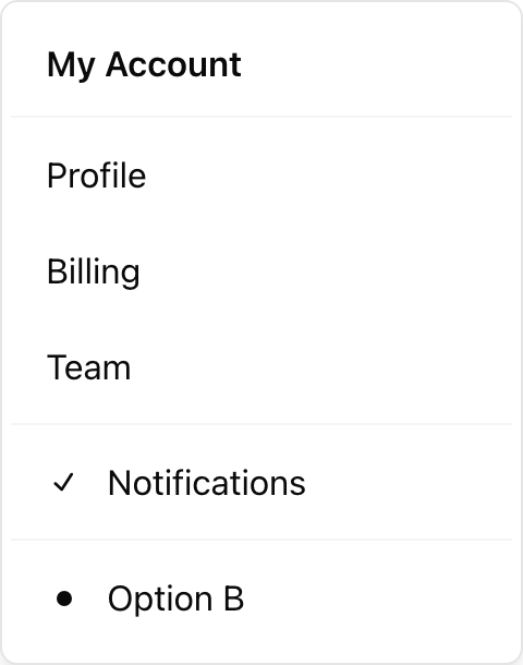
- Location:
sabo/src/components/ui/dropdown-menu.tsx
When to use
- Show grouped actions related to a trigger (row actions, avatar menu).
- Supports labels, separators, checkbox/radio items, and submenus.
Usage
sabo/src/components/ui/dropdown-menu.tsx
Key props
Space in pixels between trigger and content.
default | destructive — styles a dangerous action.This component forwards all props from Radix Dropdown Menu primitives (Root/Trigger/Content/Item, etc.). Above are commonly used props. For the full API, see Radix docs: https://www.radix-ui.com/primitives/docs/components/dropdown-menu
Styling tip
- Keep menus compact (
text-sm). Use separators and labels to group related actions. - For submenus, use
DropdownMenuSuband related parts.
Accessibility
- Trigger is a native button by default (
asChildsupported). - Arrow keys navigate items; checked/radio items announce state.