

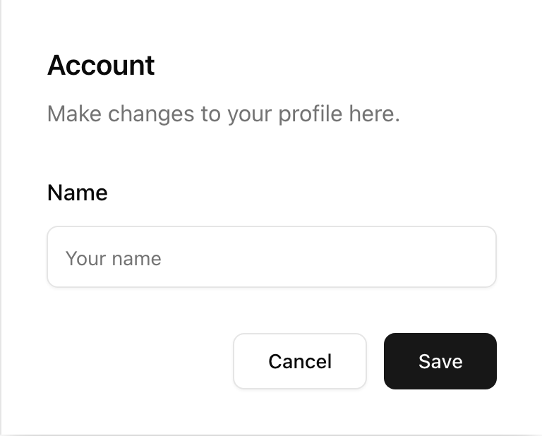
- Location:
sabo/src/components/ui/sheet.tsx
When to use
- Secondary surfaces for settings, filters, or context details.
- Use right/left edges for app side panels; top/bottom for mobile drawers.
Usage
sabo/src/components/ui/sheet.tsx
Key props
top | right | bottom | leftControls the close icon size utility.
This component forwards all props from Radix Dialog primitives (Root/Trigger/Content, etc.). Above are commonly used props. For the full API, see Radix docs: https://www.radix-ui.com/primitives/docs/components/dialog
Styling tip
- Right/left sheets have fixed widths; use
sm:max-w-smoverrides for custom sizes. - Keep body content scrollable and put actions in
SheetFooter.
Accessibility
- Uses dialog semantics with overlay and focus trapping.