

- Location:
sabo/src/components/ui/scroll-area.tsx
When to use
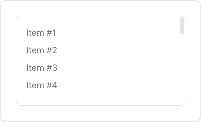
- Constrain overflow for long lists or code blocks with consistent, themed scrollbars.
- Use for panels and menus that require scrolling.
Usage
sabo/src/components/ui/scroll-area.tsx
Key props
Set fixed
height/width for the viewport. Rounded corners are preserved.This component forwards all props from Radix Scroll Area primitives (Root/Viewport/Scrollbar, etc.). Above are commonly used props. For the full API, see Radix docs: https://www.radix-ui.com/primitives/docs/components/scroll-area
Styling tip
- Customize thumb and rail with
[data-slot=scroll-area-thumb]and scrollbar orientation classes.
Accessibility
- Keep focus outlines on the viewport (
focus-visiblestyles already applied).