

- Location:
sabo/src/components/ui/table.tsx
When to use
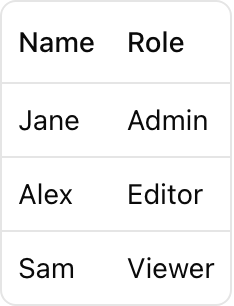
- Present tabular data with headers and rows.
- Use for datasets that benefit from columnar comparison.
Usage
Key parts
Table
Responsive wrapper with horizontal scroll for overflow.
TableHeader/TableBody/TableRow/TableHead/TableCell
Semantic wrappers for accessible table markup.
Optional footer row group.
TableCaption
Optional table caption for summaries/notes.
Styling tip
TheTable wrapper provides horizontal scroll for overflow. Keep column count reasonable.
Accessibility
- Use
TableHeaderfor column headers andTableBodyfor data rows. - Screen readers navigate by column/row; provide clear, descriptive headers.
- For sortable tables, indicate sort direction with
aria-sort.