

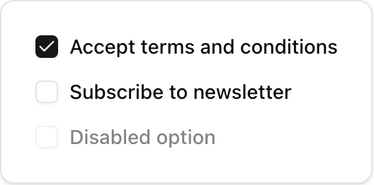
- Location:
sabo/src/components/ui/checkbox.tsx
When to use
- Boolean fields where submission is explicit (terms, filters).
- For immediate on/off actions consider a Switch.
Usage
sabo/src/components/ui/checkbox.tsx
Key props
Initial checked state. Use
checked for controlled forms.Override size or colors (e.g.,
size-5, text-primary).This component forwards all props from Radix Checkbox primitives (Root/Indicator). Above are commonly used props. For the full API, see Radix docs: https://www.radix-ui.com/primitives/docs/components/checkbox
Styling tip
- Change checkmark size by targeting
[data-slot=checkbox-indicator] svg. - Keep small hit targets paired with a label to increase click area.
Accessibility
- Always include a visible label adjacent to the control.