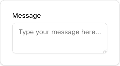
- Location:
sabo/src/components/ui/textarea.tsx
When to use
- Freeform, multi-line responses (messages, descriptions).
- Use Input for single-line text.
Usage
sabo/src/components/ui/textarea.tsx
Key props
Sets the initial height. Combine with
className height utilities.Width/height and overrides (
w-80 h-24, rounded-lg).Styling tip
- Textareas grow with content by default (
field-sizing-content); set a fixed height if needed.
Accessibility
- Provide a descriptive label. Use
aria-invalidand error text when validation fails.