

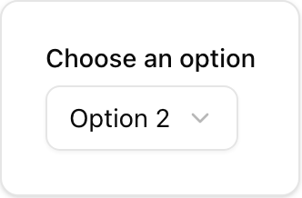
- Location:
sabo/src/components/ui/select.tsx
When to use
- Choose a single option from a list. Supports groups, separators, and scrolling.
- Prefer Combobox/Command for long, searchable lists.
Usage
sabo/src/components/ui/select.tsx
Key props
default | sm — controls trigger height.Popover positioning mode (
content or popper).This component forwards all props from Radix Select primitives (Root/Trigger/Content/Item, etc.). Above are commonly used props. For the full API, see Radix docs: https://www.radix-ui.com/primitives/docs/components/select
Styling tip
- Make the trigger width explicit (
w-44) to prevent reflow as values change. - Use
SelectSeparator,SelectLabelto organize long menus.
Accessibility
- Announces value changes; ensure visible label or placeholder text is present.