

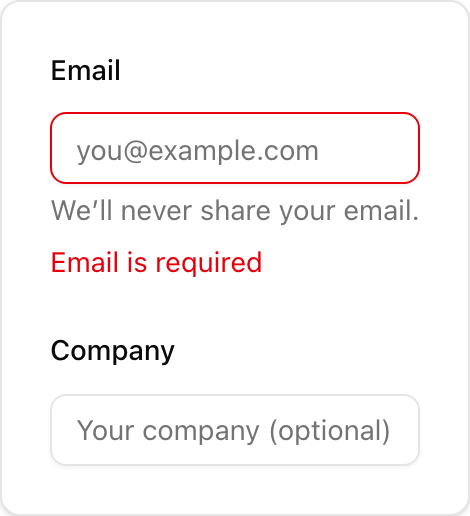
- Location:
sabo/src/components/ui/field.tsx
What it is
- Layout wrapper for a form control. It does not render an input by itself.
- Provides slots:
FieldLabel,FieldContent,FieldDescription,FieldError. - Supports
orientation:vertical(default),horizontal,responsive.
When to use
- You want a consistent pattern with label + control + help/error text.
- You need horizontal alignment (label left, control right).
How it differs from others
- Field vs Input: Field is the container; Input is the control inside.
- Field vs Label: Field includes a label slot but is not a label itself.
- Field vs Input Group: Input Group composes prefixes/suffixes around a control; Field composes the meta text around a control.
Minimal usage
sabo/src/components/ui/field.tsx