

- Location:
sabo/src/components/ui/button.tsx
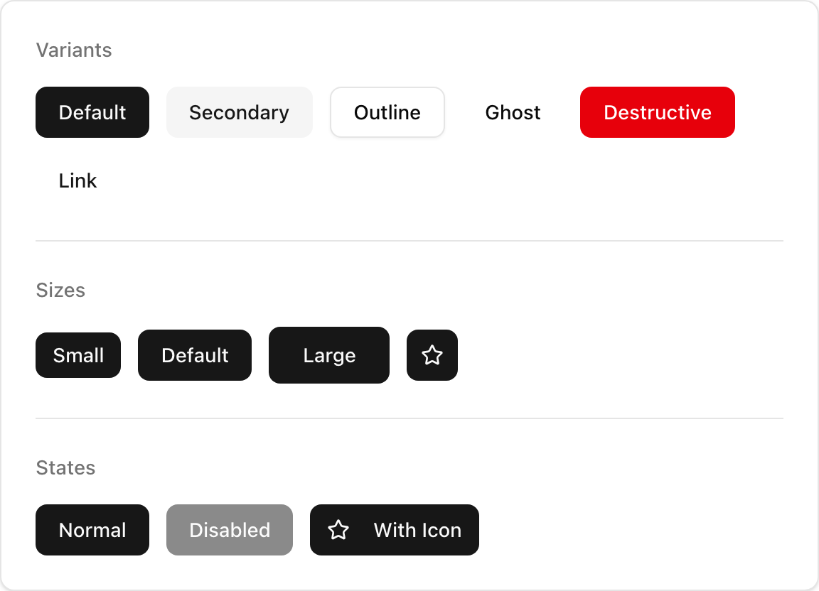
When to use
- Trigger primary and secondary actions (submit, save, navigate).
- Use icon sizes (
icon,icon-sm,icon-lg) for square icon-only buttons.
Usage
sabo/src/components/ui/button.tsx
Key props
default | secondary | outline | ghost | link | destructive
default | sm | lg | icon | icon-sm | icon-lg
Render as the child element (e.g., wrap a Link) while preserving Button styles.
Styling tip
Use variants and sizes first. Reach forclassName only for small tweaks (spacing, radius).
Accessibility
- Provide clear text. For icon-only buttons, add
aria-labelor include visually hidden text. - Use
type="submit"when inside forms; mark disabled states appropriately. - Ensure sufficient color contrast; avoid conveying state with color alone.