

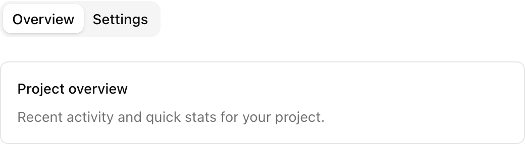
- Location:
sabo/src/components/ui/tabs.tsx
When to use
- Organize related content into multiple panels without navigating away.
- Use when content sections are distinct but related (e.g., Overview, Settings, History).
Usage
Key props
Initial or controlled active tab value.
Associated value to activate a tab.
Content shown when the matching value is active.
This component forwards all props from Radix Tabs primitives (Root/List/Trigger/Content). Above are commonly used props. For the full API, see Radix docs: https://www.radix-ui.com/primitives/docs/components/tabs
Styling tip
Keep tab labels concise and use subtle styling for a professional look.Accessibility
- Tab navigation with arrow keys and Enter/Space to activate.
- Only the active
TabsContentis visible; others are hidden but remain in the DOM. - Use descriptive labels for triggers to convey content clearly.