

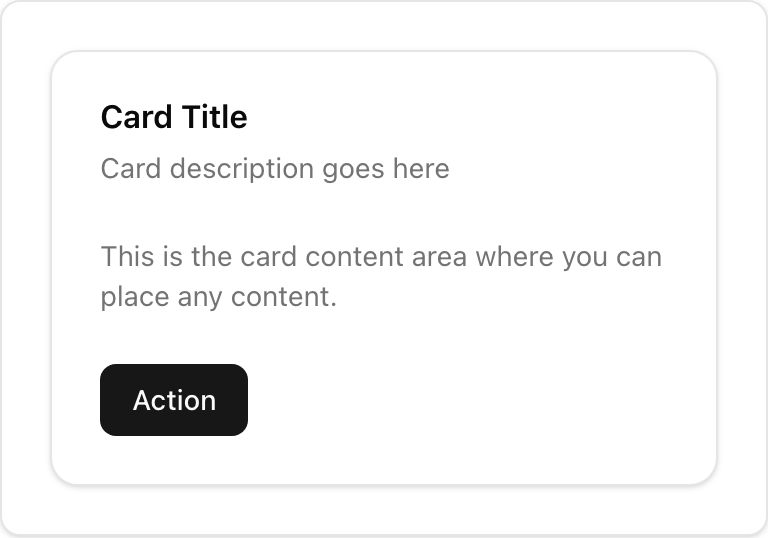
- Location:
sabo/src/components/ui/card.tsx
When to use
- Group related content and actions with a clear container.
- Use headers/footers for titles and actions; keep content focused.
Usage
sabo/src/components/ui/card.tsx
Key parts
CardHeader
Title/description area. Use
CardAction for right‑side actions.CardContent
Main body region for text or components.
Actions or secondary info.
Styling tip
- Keep vertical rhythm consistent (
py-6default). Adjust withclassName. - Avoid over‑nesting; Cards should be simple.
Accessibility
- Provide clear heading text (
CardTitle) for screen reader context.