

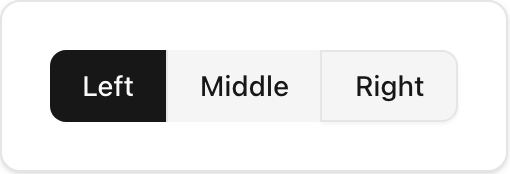
- Location:
sabo/src/components/ui/button-group.tsx
When to use
- Group related actions tightly with shared borders and spacing.
- Useful for segmented controls, filter bars, or adjacent actions.
Usage
sabo/src/components/ui/button-group.tsx
Key props
horizontal (default) | verticalRender text wrapper as child element (useful for links).
Styling tip
- The group composes borders automatically; keep children border‑consistent (
variant=“outline”works well). - Add separators with
ButtonGroupSeparatorto divide controls.
Accessibility
- The container uses
role=“group”. Provide context with nearby labels or headings.